halve
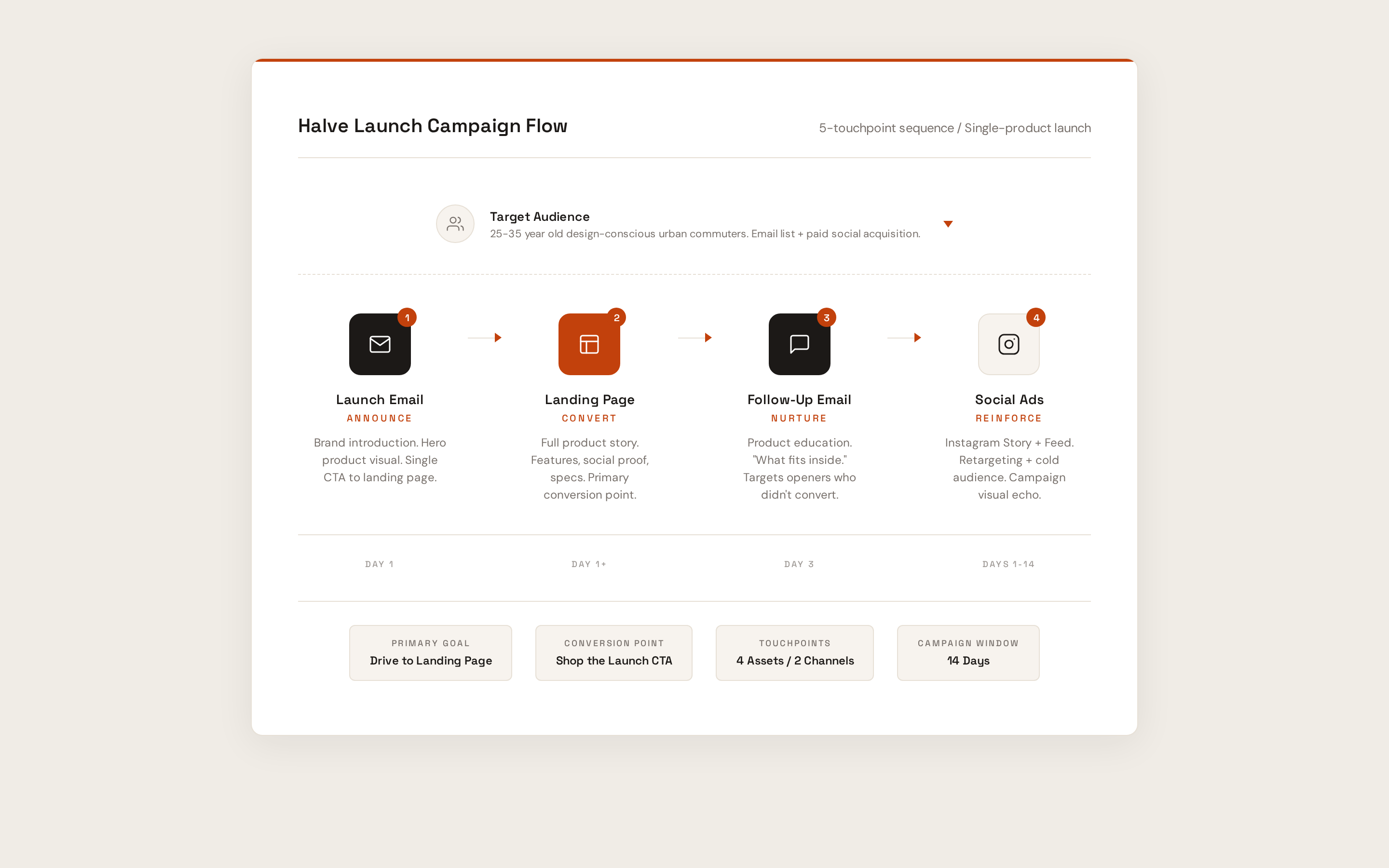
a full ecommerce launch campaign for a modular sling-to-backpack system. two emails, a landing page, social ads, and a unified brand system, designed end to end.
your whole day. one bag.
Halve is a fictional DTC brand built as a portfolio case study. The product is a modular sling-to-backpack system for urban professionals. I designed the complete launch campaign: brand identity, design system, two marketing emails, a conversion landing page, and Instagram ads. Every touchpoint shares one visual language, built from a single token system.
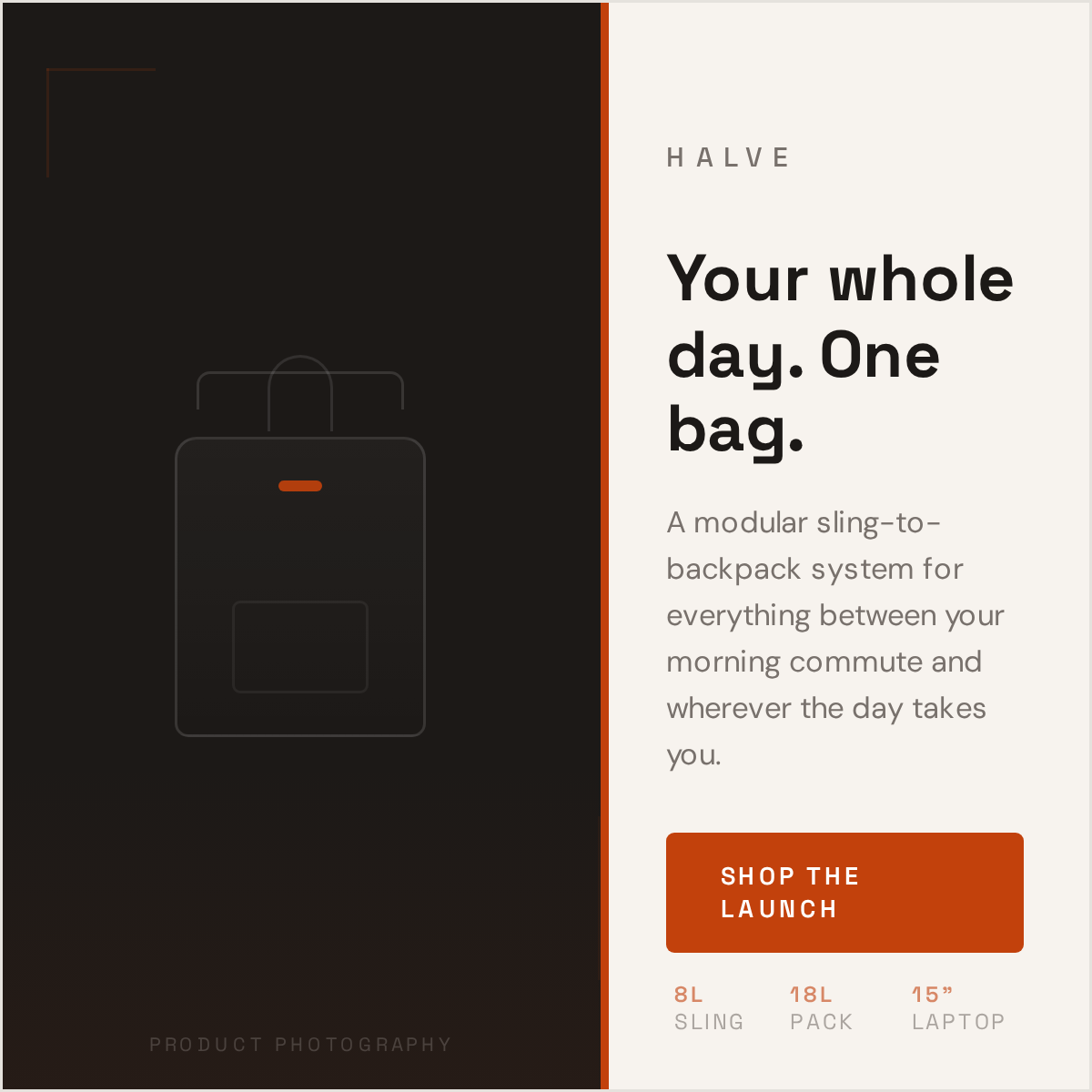
launch email
the first touchpoint. announces the product with a single hero image, one headline, and a clear CTA. designed for desktop and mobile at 600px max width.
designed to land like a real campaign
the email system was shown inside an inbox-style context so the launch could be judged the way a customer would actually encounter it.
landing page
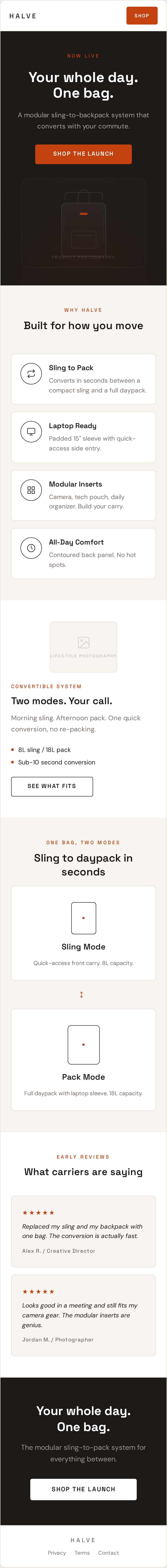
the conversion destination. stripped nav, hero with CTA, feature grid, social proof, and a final CTA. designed as a full-length scroll for desktop and mobile.
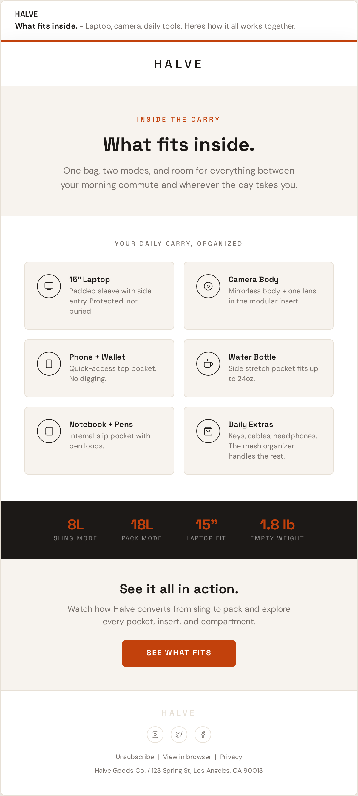
follow-up email
the nurture email. different layout, different angle: "what fits inside." reinforces value for subscribers who didn't convert on the first send.
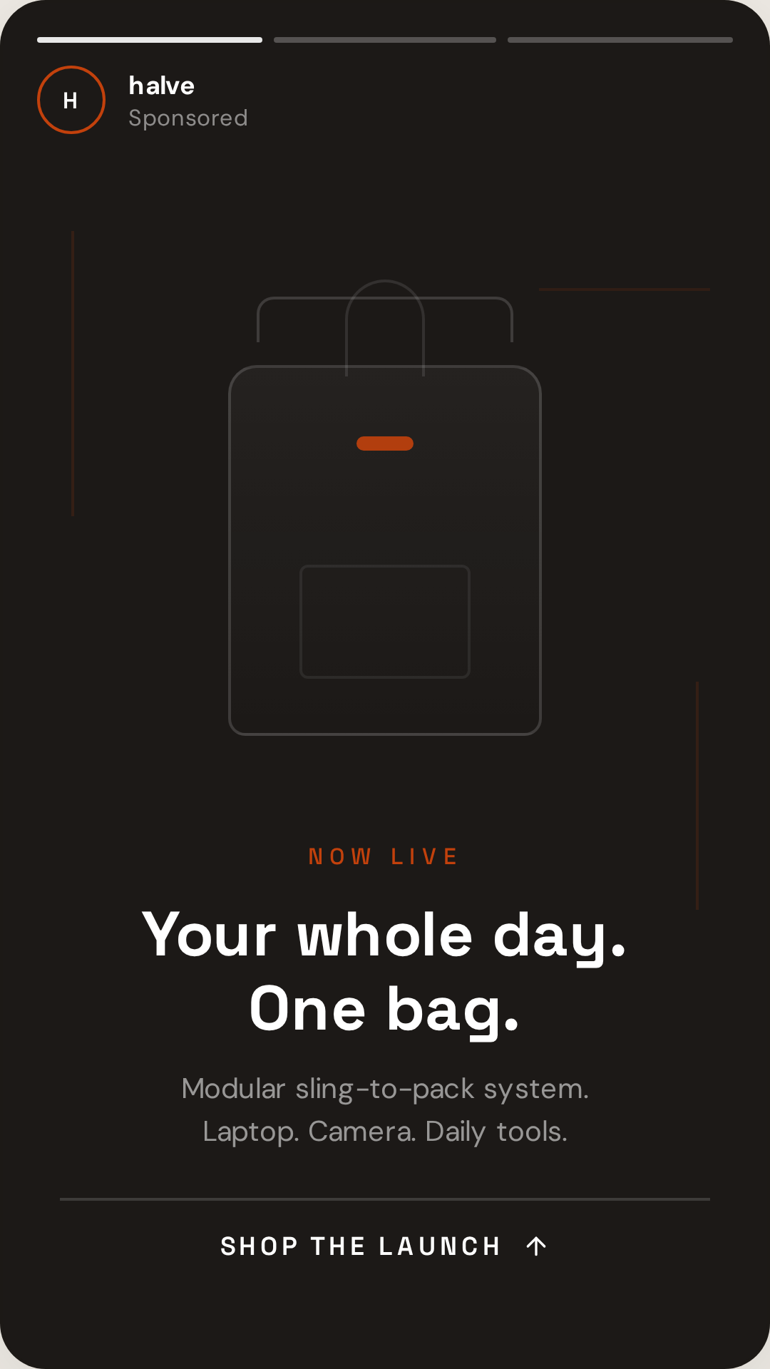
social ads
instagram story (1080x1920) and feed post (1080x1080). adapted from the campaign's visual system for paid social.
design system first
every color, type level, button, and spacing value was defined as a token before any layout work began. the campaign is the system, not a collection of one-offs.
responsive by default
email layouts were built at 600px max width with mobile-first stacking. the landing page uses a 12-column grid that collapses cleanly.
email constraints
real email rendering limits were respected: no custom fonts in body, table-safe layouts, system font stacks as fallback, image-based hero with alt text.
campaign coherence
a recipient who sees the email, clicks to the landing page, gets a follow-up, and sees a story ad encounters one brand, not four separate designs.
typography
Space Grotesk for display and CTAs, DM Sans for body copy. two fonts, seven levels, consistent hierarchy across every touchpoint.
tools
designed in HTML/CSS with AI-assisted iteration. production assets sized for email clients, web, and social platforms.